
patience! the page takes a few moments to load
DISPLAY 2: The datacharts show % prevalence of each dyslexia dimension as encountered by each QNR respondent.
The data (pale blue) is overlaid onto the mean (average) of all respondents' data for that dimension (pale grey); mouseover any datapoint to display the data for that point.
More information about this data is here: and information about controlling this display is here:
The data (pale blue) is overlaid onto the mean (average) of all respondents' data for that dimension (pale grey); mouseover any datapoint to display the data for that point.
More information about this data is here:
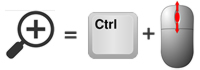
Controlling this display:
Once the page has fully loaded, the display will scroll automatically to the left.
Move the mouse over any data point on any profile to see the data for that data point - the mean average for that 'dimension' is shown above the % attributed to that dimension by that respondent.
The speed of the scrolling, either to the left or to the right, is controlled by moving the mouse across the shaded areas at the extreme left or right of the rolling display. When the mouse is moved out of these areas, the display stops and movement is then re-activated by moving the mouse over the shaded areas again.
The display is on a continuous loop.